New EE
The new EE was born to enable the BT group achieve their ambition of being the most personal and customer-focused technology brand in the UK.
With those lofty ambitions came a new visual identity to help the brand grow and develop. A new and improved visual identity that takes the strengths of the brand consumers know and love and supercharges them.
Colour
The aqua and yellow EE is famous for were supercharged, and a bright and light aqua were introduced. From these core colours I worked with the Brand and Design System team to create a 10 step colour palette to improve usability and accessibility in digital, while bringing consistency to digital products and experiences.

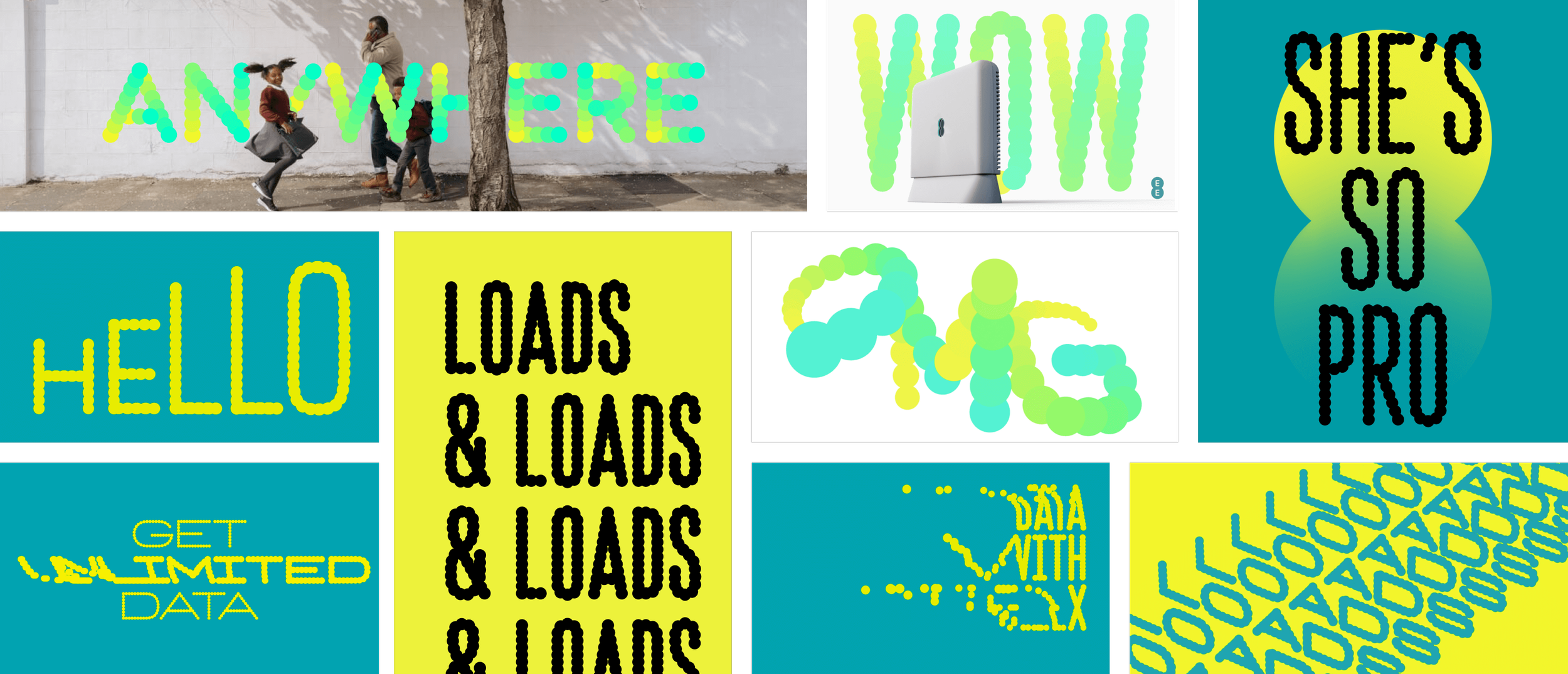
Typefaces
The EE brand team and branding agency (Zag) partnered with Colophon to create two new typefaces for the brand. From a digital side I worked with Brand help to craft and shape typefaces that ensured legibility and accessibility was key. The result is two typefaces, Dottee and Non-Dottee, that work well as a team and are instantly recognisable.

Working alongside brand and the Design System team, the digital team explored how what the new brand could look like across the digital landscape, taking an app first approach. Below is a snapshot of what was explored: